Special Reach
Project Name
Special Reach
Headquarters
San Antonio, TX
Industry
Non-Profit
Company Size
10+ employees
Timeline
2 Months

Special Reach is a nonprofit dedicated to serving families of children with developmental delays. Their mission is to create joyful, safe, and inclusive environments through summer enrichment camps and respite programs during the school year. Despite their meaningful work, their digital presence did not fully reflect the warmth and accessibility of their in-person programs.
Special Reach needed a user-friendly, accessible digital experience that conveyed their mission while making it easier for parents to learn about programs, register their children, and get involved.
.webp)
During the initial analysis and user research, several key usability and credibility issues were identified on the existing Special Reach website. While the organization’s mission is deeply impactful, the digital experience did not effectively communicate its value or support user needs.
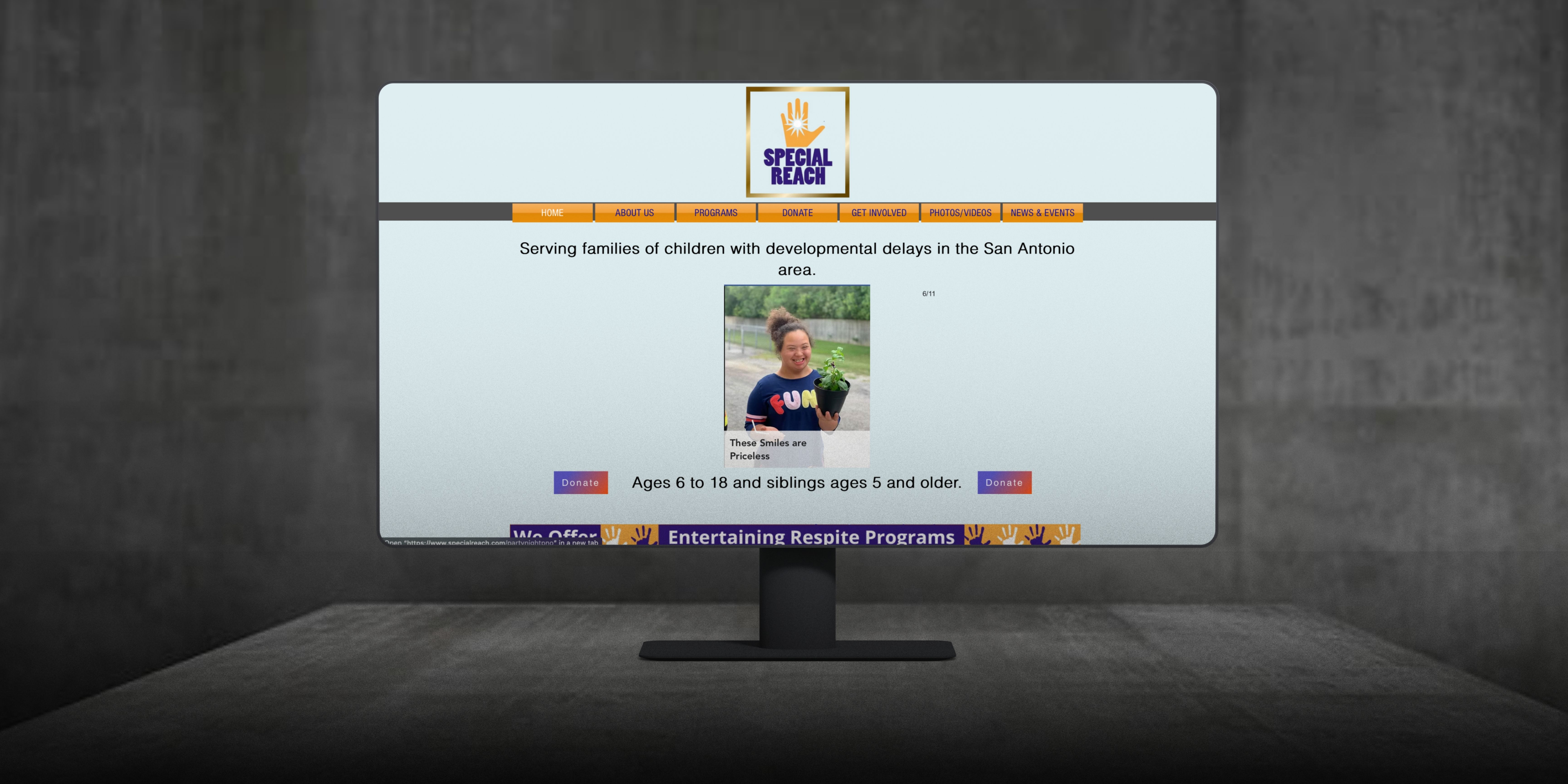
One of the primary concerns expressed by users was the excessive presence of "Donate" buttons scattered throughout the site. This oversaturation created visual noise and led users to question the legitimacy of the organization, with some describing the layout as “tacky” or even “scam-like.” This directly undermined user trust—a critical factor for nonprofits relying on community support.
In addition, the site’s visual identity, while intended to be cheerful and energetic, was overly saturated with bright colors. This contributed to a chaotic aesthetic that failed to meet basic web accessibility standards, particularly in terms of color contrast and readability for users with visual impairments or cognitive differences.
The website’s information architecture also presented challenges. Users struggled to find relevant information due to cluttered navigation, redundant page structures, and outdated content. For instance, the Announcements page contained numerous expired events, which diluted the site’s overall relevance and professionalism. Similarly, the “About Us” section was fragmented across multiple sparse pages, making it difficult for users to grasp the organization’s mission and impact in a single, cohesive narrative.
These issues collectively hindered user trust, accessibility, and engagement—key pillars for a nonprofit organization aiming to connect with families of children with developmental delays.
To address the usability and trust issues uncovered during research, our design strategy focused on improving clarity, accessibility, and the overall user experience while preserving the joyful spirit of the Special Reach brand.
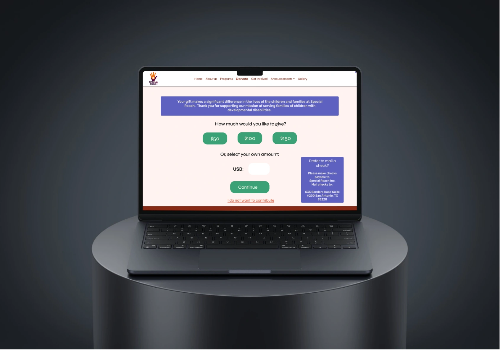
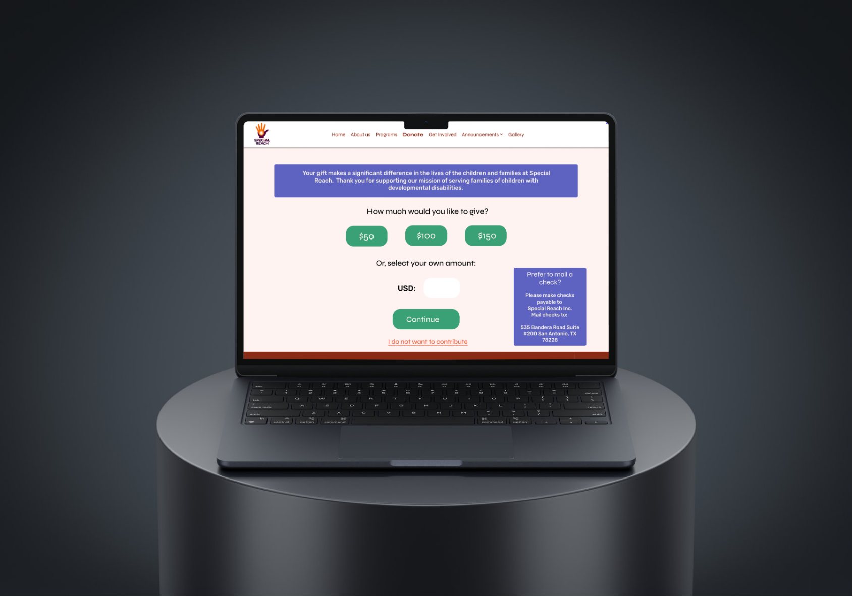
1. Streamlined Donation Experience
Instead of displaying multiple “Donate” buttons across various sections of the website, we consolidated donation calls-to-action into a single, prominent area—strategically placed in the main navigation and footer. This approach maintained visibility for fundraising efforts without overwhelming users or compromising trust. The redesign emphasized transparency and credibility, pairing donation prompts with impact statistics and testimonials.
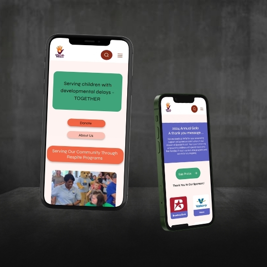
2. Accessible, Friendly Visual Identity
We refined the color palette to retain the brand’s playful and uplifting tone while ensuring full compliance with WCAG accessibility standards. Softer, high-contrast color combinations replaced the overly saturated hues, improving readability for users with visual or cognitive impairments. The revised design maintained a vibrant, kid-friendly aesthetic while delivering a more polished and inclusive visual experience.
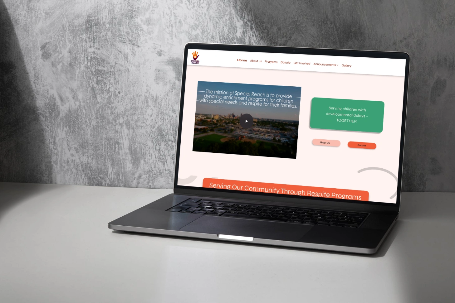
3. Simplified Information Architecture
We conducted a full audit of the site’s content structure and redefined the navigation system to enhance clarity and reduce user friction. Redundant pages were merged or removed, and core content areas—such as programs, about us, and events—were reorganized into clear, concise categories. This not only improved discoverability but also made the website feel more modern and user-focused.
4. Refreshed Content Strategy
Outdated or irrelevant information was removed to build trust and keep users engaged. The Announcements page was replaced with a dynamic, filterable calendar that displays only current and upcoming events. Additionally, the “About Us” section was consolidated into a single, visually engaging page that clearly communicates the organization’s mission, values, and team in a digestible format.
Through these solutions, we created a digital experience that is trustworthy, accessible, and emotionally resonant—reflecting the care and impact that Special Reach delivers to families every day.
We followed the five stages of Design Thinking—Empathize, Define, Ideate, Prototype, and Test—to create a user-centered redesign that reflects Special Reach’s mission while addressing core usability issues.
1. Empathize
We began by immersing ourselves in the experiences of our users. Through stakeholder interviews, empathy mapping, and persona development, we uncovered the goals, frustrations, and needs of two primary user groups:
Parents/Guardians seeking to enroll their child in programs
Donors looking for a trustworthy nonprofit to support
This phase revealed key pain points: overwhelming content, poor accessibility, and a lack of trust cues—especially on the donation flow.
2. Design
Using insights gathered during our empathize phase, we synthesized data to craft clear user problem statements. We then developed two detailed user journey maps—one for each persona—to visualize their unique goals and friction points.
For parents, key expectations included:
For donors, the focus was on:
3. Ideate
To generate targeted solutions, we held a mind-mapping session divided by user group. This enabled focused brainstorming aligned to each persona’s goals. We conducted a $100 Bill Test to simulate investment in features, helping us prioritize enhancements for the donation experience, content hierarchy, and accessibility.
Key ideation outcomes:
4. Prototype
Using insights from ideation, we created wireframes and high-fidelity prototypes that emphasized:
We also conducted a full content audit and hierarchy mapping, which informed both layout and copy decisions to reduce cognitive overload and guide user flow effectively.
5. Test
User feedback was continuously integrated through informal testing sessions, allowing us to validate layout choices, contrast adjustments, and key user flows. Parent users found it easier to locate program info and complete the enrollment path, while donor users expressed greater confidence in the legitimacy of the organization post-redesign.
.svg)
.png)


.webp)